Overview
eptos Dictionary Manager offers users a harmonized graphical user interface for the management of Structure Elements of a Dictionary.
When opening the manager, the users see the menu (representing workspace areas for the managed structure elements) on the left side. The visibility of the menus is controlled by user rights.
Workspace areas can be accessed by clicking on a specific menu. The workspace area is displayed on the right side of the screen and starts with a tabular view of the Structure Elements managed in respective workspace.
eptos differentiates throughout all managers between a graphical user interface language and a content language. The language of the graphical user interface and of the maintained content can be set individually. Users can therefore work with graphical user interface language set in English / German and content language set to another language (e.g. French).
For structure elements without translation in a selected content language, the system uses the default system language as fallback and signals the missing translation with an exclamation mark in front of the text.
The following Structure Elements are managed in Dictionary Manager:
The graphical user interface of the eptos Dictionary Manager consists of the following main areas:
-
Tabular view: available for all Dictionary Manager Structure Elements
-
Tree view: available for Classes, Properties, Values and Value Lists
-
Perspective view: available for Application Classes, Blocks, Properties, Values and Value Lists
-
Compare view: available for Application Classes, Blocks, Aspects, Properties, Values and Value Lists
All Dictionary Manager Structure Elements share a set of basic functionalities. Specifics related to these basic functionalities in connection with the different Structure Elements are described in the specific chapters of respective Structure Element.
Basic functionalities are:
-
Search: allows users to search for specific Structure Elements
-
Create: allows creation of new Structure Elements
-
Change Text: allows editing of existing Structure Elements
-
Delete: allows deletion (deprecation) of existing Structure Elements
-
Assign: allows connection of Structure Elements
-
Withdraw: allows withdrawal of structure elements or of their connection to other Structure Elements
-
Reactivate: allows re-activation of deprecated Structure Elements or of their connection to other Structure Elements
-
Copy: allows copying of Structure Elements in order to be used in paste-actions (for creation of assignments)
-
Compare: allows the comparison of two or more Structure Elements of the same type
-
Export: allows the export of Dictionary Manager Structure Elements
-
Import: allows the import of Dictionary Manager Structure Elements
The following section describes the main areas of the graphical user interface and some basic functionalities. Further information on basic and specific functionalities are described in the specific chapters of respective Structure Element.
/*<![CDATA[*/ div.rbtoc1770892091296 {padding: 0px;} div.rbtoc1770892091296 ul {list-style: disc;margin-left: 0px;} div.rbtoc1770892091296 li {margin-left: 0px;padding-left: 0px;} /*]]>*/ Overview Tabular View Quick Search Advanced Search Sorting Filters Filter Sets Create Filter Set Edit Filter Set Delete Filter Set Define as Group Filter Set Set Filter Set as default Select Filter Set Tree View Tree Icons View Details of Dictionary Elements in Tree View Reorder Elements Remote Dictionary Tree View Perspective View Perspective Toolbar List Toolbar Compare View
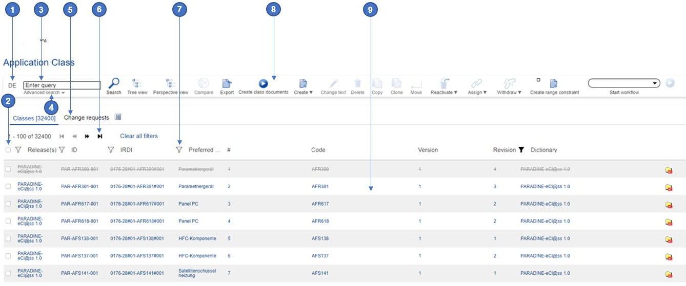
Tabular View
All Dictionary Manager Structure Elements are organized in a tabular view. This is the default view when the user enters the workspace area of a specific Structure Element.
The tabular view offers users the possibility to browse and search the available Structure Elements.
The tabular view is subdivided into two tabs: one tab for released Structure Elements and one for (6.2) (dicmgr user) Change Requests.
Moving from one page to the next page and back is possible via the Next/Previous buttons available in the left top of the table. In front of the Next/Previous buttons, the system displays the number of results found for a specific query.
The tabular view is configurable according to users' needs from the configuration panel located in each tabular view above the list, on the far right hand side (gear wheal symbol). From this column management dialog columns can be set as hidden / visible, the order of columns can be changed and user can add / remove link to the data displayed in relevant column.
System allows user to search for columns in the dialog list so that these actions of column management can be performed quicker, since user can search for and find the needed column via a search function instead of manual scrolling.
User can also configure the number of results displayed per page (available option 15, 25, 50, 100 results per page in the right top of the table).
In these tabular view columns the standard and extended attributes of the specific Structure element are represented. The columns have sorting, filtering options and their width can be adjusted as needed. They are also provided with following match inputs where needed:
-
Match fragments → Matches all fragments in the input (split by space) separately
-
Match all from start → Matches the whole input from start
-
Match all→ Matches the whole input in any position
-
Equal → Exact match
In the Tabular view user has also has an export to excel function for exporting all visible columns.
The tabular view offers users the following options:
|
No. |
Name |
Description |
|---|---|---|
|
1 |
Content language selector |
Allows users to switch between available content languages. Note: the graphical user interface language is changeable independent of the content language. |
|
2 |
Selection box |
Allows users to select the Structure Element which will be worked on. |
|
3 |
Search field |
Allows users to enter their search string in order to easily retrieve needed data. |
|
4 |
Advanced search |
Allows users to define in which attributes and with which options the search will be performed. |
|
5 |
Tabs |
Allows user to switch between already released Structure Elements and Change Requests for Structure Elements. |
|
6 |
Navigation buttons |
Allows users to navigate to next pages or back to previous pages. |
|
7 |
Column headers |
Allows uses to sort the content of columns respectively to filter the content for a better retrieval of results. |
|
8 |
Toolbar |
Allows users to work on the data displayed in the tabular view. |
|
9 |
Configurable table view |
Allows user to view available content in an organized way, which may be configured to their own needs. |
Quick Search
All tabular views of Dictionary Manager Structure Elements as well as tabular views under relevant toolbar options (e.g. assign) offer a "Search" functionality with harmonized search criteria and options. The search can be triggered by selecting Search option.
Tabular views have a sticky header that allows user to see the column headers even if displayed entries on page are set to more than 15 and user needs to scroll down.
Advanced Search
The advanced search can be opened by pressing the Advanced Search arrow situated below the search field.
The following harmonized choice is available for "Search In" (Radio Buttons: only 1 can be selected):
|
Search in |
Enter query |
Explanation |
|---|---|---|
|
ID |
Ex.: PAR-AKB116-001 |
Item data contained in the identification (IRDI, SCV, Code) |
|
Preferred Name |
Ex.: Gripper Jaw |
Item data contained in column Preferred name |
|
All fields |
Ex.: Notebook |
Full Text Search. Search in all Fields and Extended Attributes (which cannot store only Numbers or a flag) |
Note: the field where the search query is typed cannot contain wildcards (ex.: *, %.).
The following harmonized choice is available as "Search options" (Radio Buttons: only 1 can be selected):
|
Search options |
Enter query |
Results |
Explanation |
|---|---|---|---|
|
Match fragments (equals old "Fragment Search") |
Ex.: "Rubber gasket" |
Ex.: "Gasket with rubber collar", "Rubber collar for gasket", "Gasket", "Rubber gasket", "Cylinder with rubber gasket", "Cylinder with rubber gasket (not specified)", "Rubber gasket (not specified)". |
Matches all fragments from the input (split by space) separately. System finds all entries containing these strings even if they are not in this entered order. |
|
Match all from start (equals old "Match pattern from start" + "Fragment Search disabled") |
Ex.: "Rubber gasket" |
Ex.: "Rubber gasket", "Rubber gasket (not specified)". |
Matches the whole input from start. System returns only and all results which start with the search query. |
|
Match all |
Ex.: "Rubber gasket" |
Ex.: "Rubber gasket", "Cylinder with rubber gasket", "Cylinder with rubber gasket (not specified)", "Rubber gasket (not specified)". |
Matches the whole input in any position. System returns all results which contain search query as a block, no separated. |
Sorting
The columns in the Tabular view offer sorting possibilities. Sorting the results in ascending/descending order is possible by clicking on the column header. An arrow situated in front of the header, pointing upwards or downwards indicates that respective column is already ascendingly or descendingly sorted.
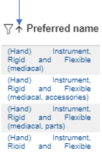
Filters
The columns in the tabular view offer sorting and filtering possibilities. Sorting the results in ascending/descending order is possible by clicking on the column header. Filtering the results is possible via the filters placed in the left side of the column header.
|
No. |
Filter Type |
Description |
|---|---|---|
|
1 |
Free text input |
Columns representing attributes with free text input allow users to further refine the search results by additional search in respective attribute |
|
2 |
Predefined list of values |
Columns representing attributes with predefined list of possible values allow users to further refine the search results by selecting one or more of the predefined values for respective attribute. |
|
3 |
Date |
Columns representing dates allow user to filter the search result base on a specific date (e.g. creation date, version date etc.). |
Filter Sets
Several set column Filters can be stored together as Filter Sets.
They help Users in lists to store and apply the column Filters of the respective tabular view. By using Filter Sets, Users do no longer need to manually select often-used column Filters again and again.
The drop-down containing the available Filter Sets in a list is available on the right of the Navigation buttons. If no specific Filter Set is defined as default for respective list "(No set)" is displayed.
Create Filter Set
In order to Create a new Filter Set the User needs to select option "Configure filters sets" on the right of the Set drop-down.
System opens the Manage filters sets interface. Here the User needs to select option "Create a new filters set", then fill in the Name of the Set to be created, then select option Create. The new Set will be displayed at the bottom of the list. At this point, only the empty Set is available by Name only. The User now needs to add the actual Filters he needs to this Set.
In order to do so, he needs to follow the three steps below:
-
select the newly created Set by pressing the radio button on its right, in the Filter Set drop-down
-
set desired Filters to desired columns
-
select Save filters sets option on the right of the "Configure filters sets" option.
Note: system does not allow creation of two Filter Sets with the same name for the current User.
Edit Filter Set
Filter Sets can be edited both what their Name and what their contained Filters are concerned.
In order to edit the Name of a Set, the User first needs to select option "Configure filters sets" on the right of the Sets drop-down. System opens the Manage filters sets interface. Here the User needs to select Edit filters sets icon on the right of the Set to be edited. System opens the interface in which the Name can be edited, including Update option, to be pressed after change is done.
In order to edit the Filters contained in a Set, the User has two possibilities:
-
remove Filters currently available in a Set → this can be done by expanding the respective Set in the Set drop-down and clicking the Clear filter icon available on the right of the Filter to be removed
-
add Filters to selected Set → this is done by selecting the respective Set in the Set drop-down, setting the desired additional Filters in respective columns and then selecting Save filters sets option on the right of the "Configure filters sets" option.
Delete Filter Set
In order to delete a Filter Set, the User first needs to select option "Configure filters sets" on the right of the Set drop-down. System opens the Manage filters sets interface. Here the User needs to select the Delete filters sets icon on the right of the Set to be deleted. System then asks for confirmation and, as soon as the User selects Delete option, list is updated by having respective Set removed.
Define as Group Filter Set
This functionality is available only for Base Module Administrator User and it helps defining specific Sets as Group Filter Sets. On condition that Base Module Administrator User connects these Sets to the Group, all Users belonging to respective Group will have access to these Sets.
In order to define a Set as Group Set, the User first needs to select "Configure filters sets" option on the right of the Set drop-down. System opens the Manage filters sets interface. Here the User needs to select the Define as group filters sets icon on the right of the desired Set. The icon turns from grey to black, in order to signal the change.
Group Filter Sets cannot be renamed or deleted by regular Users.
Set Filter Set as default
System offers 2 distinct possibilities to set a filter set as default:
-
at user level (defined by each user and being applied only for that user)
This functionality helps Users define specific Sets as default.
In order to define a Set as default, the User first needs to select "Configure filters sets" option on the right of the Set drop-down. System opens the Manage filters sets interface. Here the User needs to select the Set default filters set icon on the left of the desired Set. The icon turns from grey to black, in order to signal the change.
The effect of this setting is that every time the User re-enters respective page, the default Filter Set will be pre-selected.
-
at menu level (defined by Administrator for each menu entry and being applied for all users in that menu entry)
User with Base Module Administrator rights has also the possibility to select an existing filter set as default for a certain tabular view or remove it as default.
This is configured from Base Module / Configuration / Configurable menu where administrator needs to select the needed menu entry, then select the desired filter set in field "Default filter set“ and select Save option.
The result is that all users entering that specific tabular view, will have the pre-selected default filter set already applied to list.
Select Filter Set
System allows Users in all tabular displays to select a Filter Set from the available list. The filters belonging to selected Set will be immediately applied and the name of the currently applied Set is displayed in the box.
The list of available Filter Sets is comprised of:
-
Own Filter Sets
-
Filter Sets inherited by Role/Group of the current User
Only Users having Base Module Administrator role assigned will see all Filter Sets from all Users.
Tree View
In addition to the tabular view, the system offers the possibility to view the Structure Elements in a hierarchical structure.
The hierarchical structure of Structure Elements can be accessed via Tree View symbol. The displayed Tree Views depend on the menu from which the tree view is accessed. The following four tree views (in different combinations) are basically available:
-
Classification tree: displays
Classification Classes
in a hierarchical view. The Classification Classes are arranged in the Classification tree based on their coded name. In case Application Classes are assigned to the Classification Classes, the tree can be expanded to find desired Classification Class and the connected Application Class. If the user has defined in the user profile that properties, values and aspects should also be displayed in the tree, the Application class can be also expanded to see the connected Structure Elements.
-
Application Class tree: displays Application Classes in a hierarchical view. In case the Application Classes form a flat hierarchy (i.e. the Application Classes do not have additional specializations), they are grouped in letter folders based on the first letters of their preferred names. The tree can be expanded to find desired Application Classes. If the user has defined in the user profile that properties, values and aspects should also be displayed in the tree, the Application class can be also expanded to see the connected Structure Elements.
-
Block tree: displays Blocks in a hierarchical view. In case the Blocks form a flat hierarchy (i.e. the Blocks do not have additional specializations), they are grouped in letter folders based on the first letters of their preferred names. The tree can be expanded to find desired Block. If the user has defined in the user profile that properties, values and aspects should also be displayed in the tree, the Block can be also expanded to see the connected Structure Elements.
-
Aspect tree: displays Aspects in a hierarchical view. In case the Aspects form a flat hierarchy (i.e. the Aspects do not have additional specializations), they are grouped in letter folders based on the first letters of their preferred names. The tree can be expanded to find desired Aspects. If the user has defined in the user profile that properties, values and aspects should also be displayed in the tree, the Aspect can be also expanded to see the connected Structure Elements.
The hierarchical view offers users the following options:
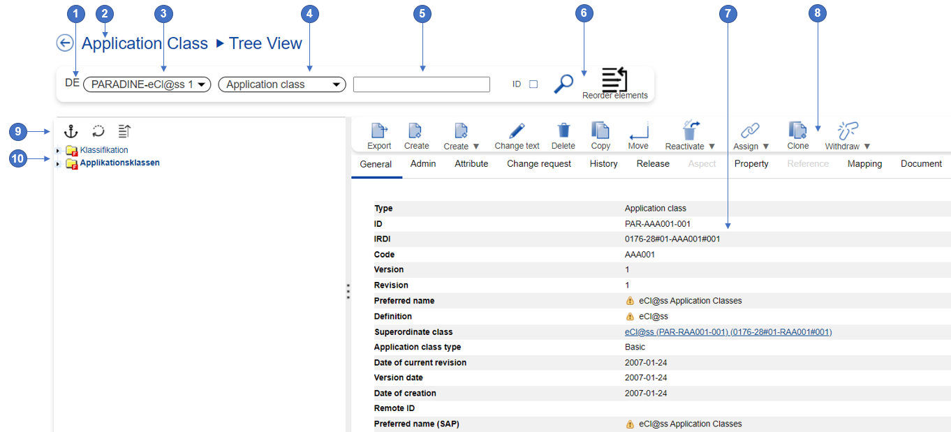
|
No. |
Name |
Description |
|---|---|---|
|
1 |
Content language selector |
Allows users to switch between available content languages. Note: the graphical user interface language is changeable independent of the content language. |
|
2 |
Breadcrumb |
Breadcrumb is a mandatory block that is present on every page and displays which page the user is currently on. It also allows you to quickly go to previous pages from the same chain of links. |
|
3 |
Release selector |
Allows users to switch between different releases and thus change the content displayed in tree. |
|
4 |
Business object selector |
Allows users to refine the search by defining the business object searched for. |
|
5 |
Search field |
Allows users to enter their search string in order to easily retrieve needed data. |
|
6 |
Toolbar |
Allows users to work on the data displayed in the tree view. |
|
7 |
Details view of selected element |
Displays information on the Structure Element selected in the tree view. |
|
8 |
Toolbar of selected element |
Allows users to work on the Structure Element selected in the tree view. |
|
9 |
Manage hierarchy options |
Allows users to collapse an expanded tree, refresh the tree or have only a section of the tree displayed (anchor). |
|
10 |
Hierarchical trees |
Displays the Structure Elements in a hierarchical view. |
Tree Icons
|
Icon |
Icon Description |
|
|
Classification class folder |
|
|
Advanced application class folder |
|
|
Basic application class folder |
|
|
Document application class folder |
|
|
Material application class folder |
|
|
Product structure application class folder |
|
|
Template folder |
|
|
Template view folder |
|
|
Prescribed node property |
|
|
Prescribed node property with overwritten name |
|
|
Prescribed class folder |
|
|
Prescribed class folder with overwritten name |
|
|
Hierarchy folder |
|
|
Class group folder |
|
|
Aspect folder |
|
|
Value list folder |
|
|
Value |
|
|
Class value assignment |
|
|
Used Reference property |
|
|
Used property |
|
|
Simple used property |
|
|
Change request correction |
|
|
Create new classification class |
|
|
Delete classification class |
|
|
Reactivate deprecated classification class |
|
|
Create new advanced application class |
|
|
Create new basic application class |
|
|
Create new document application class |
|
|
Create new material application class |
|
|
Create new application class |
|
|
Create new aspect |
|
|
Create new block |
|
|
Delete block |
|
|
Delete aspect |
|
|
Reactivate deprecated application class |
|
|
Create block-application class reference |
|
|
Create block reference |
|
|
Change request default reference |
|
|
Split classification class |
|
|
Join classification class |
|
|
Create new class value assignment (CVA) |
|
|
Delete class value assignment (CVA) |
|
|
Create new constraint |
|
|
Delete constraint |
|
|
Add synonym |
|
|
Remove synonym |
|
|
Add key |
|
|
Remove key |
|
|
Add reference property |
|
|
Add property |
|
|
Remove reference property |
|
|
Remove property |
|
|
Reactivate referenced property |
|
|
Reactivate property |
|
|
Replace reference property |
|
|
Replace property |
|
|
Replace value |
|
|
Add application class to classification class |
|
|
Add advanced application class to classification class |
|
|
Add basic application class to classification class |
|
|
Add document application class to classification class |
|
|
Add material application class to classification class |
|
|
Add aspect to application class |
|
|
Remove application class from classification class |
|
|
Remove aspect from application class |
|
|
Reactivate application class of classification class |
|
|
Reactivate aspect to application class |
|
|
Create new value list |
|
|
Delete value list |
|
|
Remove value list |
|
|
Reactivate value list |
|
|
Add value list |
|
|
Reactivate value list in property |
|
|
Add value |
|
|
Reactivate value |
|
|
Create new reference property |
|
|
Create new property |
|
|
Delete property |
|
|
Reactivate property |
|
|
Add part of application class |
|
|
Remove part of application class |
|
|
Move class away |
|
|
Move class |
|
|
Used property container folder |
|
|
Defined property container folder |
|
|
Subclass container folder |
|
|
Class value assignment (CVA) container folder |
|
|
Imported property container folder |
|
|
Suggested value container folder |
|
|
Simulation container |
|
|
Subordinated unit |
|
|
Hierarchy |
|
|
Hierarchy folder |
|
|
Change request received |
|
|
Change request next release |
|
|
Change request confirmed for accept |
|
|
Undeprecated/Virtual reactivation |
|
|
Virtual deprecation |
|
|
Node is deprecated |
|
|
Condition Property |
|
|
Dependent Property |


Search in Tree View
For an easier retrieval of needed data, the Search field in the tree view offers an auto-completer option. When a search is performed, the following search options are taken into consideration:
-
the language selected in the Content language selector
-
the business object selected in the Business object selector
-
the release selected in the Release selector
The search of a business object by its identification is possible by marking the ID checkbox.
The search results are displayed on the right side of the tree. Clicking on classification or application class search results will open the tree view to the position where respective Classification Class/Application Class is placed in the hierarchy.
View Details of Dictionary Elements in Tree View
On selection of a business object in the tree view, its detail page is displayed on the right side of the tree view. For more information on the details page, see section Details Page.
The tree view offers users the possibility of object oriented working. The toolbar above the details page allows the management of respective element. For the description of the toolbar buttons, see section Toolbar in Browse View.
Reorder Elements
The tree view offers users the possibility to change the order of business objects in the scope of a specific usage.
Following types of reorder change requests are currently possible:
-
reorder Property in Application Class
-
reorder Property in Block
-
reorder Property in Aspect
-
reorder Aspect in Application Class
-
reorder Value in Value List
The reordering of business objects is done using drag and drop. For further information see Change Order of Structure Elements.
Remote Dictionary Tree View
User with Dictionary Manager Editor rights (or ECLASS Accelerated Manager) are able to browse a remote Dictionary.
System offers user the possibility to navigate in the tree offered by ECLASS accelerated webservices and choose only the needed classes, to use their own local system and take them over into their own local Dictionary Manager.
If until now only downloading full ECLASS was possible, now customers may use this new feature with all it’s advantages.
Navigating a remote Dictionary starts in the tree view under Base Module / Search menu entry where user needs to select needed remote Dictionary from Release selector. The data is delivered by the ECLASS Accelerated REST services.
The system shows the retrieved or locally stored Dictionary elements differently from each other, so that they can be easily recognized:
-
Not downloaded elements are shown with a selectable Checkbox in front
-
Downloaded elements are shown without the selectable Checkbox and Bold, since these are already downloaded locally
Tree can be navigated like a local tree, however details of non-downloaded Dictionary elements cannot be displayed on the right-hand side Detail view, only for downloaded Dictionary elements are the details displayed.
Any node may be expanded, but when a node that is not downloaded is expanded it is not automatically downloaded in dictionary but only cached.
By marking the objects which are needed, and selecting Download option the Dictionary elements are downloaded into the local Dictionary as follows:
-
Releases will be created after selecting them in Dictionary configuration
-
If Supplier code is not existing the Supplier code is created
-
If languages are not configured, the languages are configured automatically for the downloaded Dictionary
-
If the Root (i.e. a Release) is selected, the whole ECLASS Release is downloaded
-
If any Dictionary element is selected, all parent elements up to the 1st level Classification Class are selected which are not yet downloaded
-
If an Application Class is selected all Dictionary elements within the Application Class are selected, and which are not already loaded are obtained and connected in the local system
Webservice Calls are recorded in in E2E.
eptos System needs to be connected to an Installation of the ECLASS Webservice on the Same Server by using User/Password combination. For further details please refer to the ECLASS CDP Connector User Guide and Administrator Guide documentation.
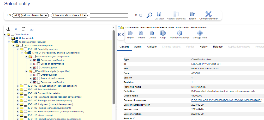
Downloaded Dictionary Element: Tree view and Detail view:
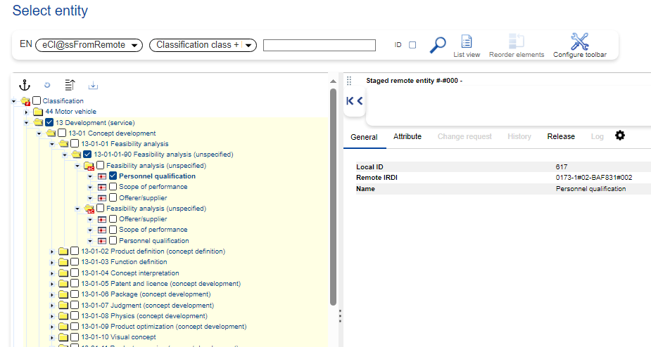
Not-downloaded Dictionary Element: Tree view and Detail view:
Perspective View
In addition to the Tabular and Tree view, the system allows to display Structure Elements in a Perspective view which can be accessed via button Perspective view.
Perspectives serve the purpose to organize dictionary Structure Elements according to arbitrary ordering criteria into libraries. Perspectives are implemented as hierarchies of classification classes (from a separate “organization objects” dictionary) to which the maintained Structure Elements from the dictionary get related. The assignment of Structure Elements to the organizing objects (classification classes) is done via drag an drop or by selection of respective Structure Elements and usage of the button Assign.
For further information see Build Up Perspectives
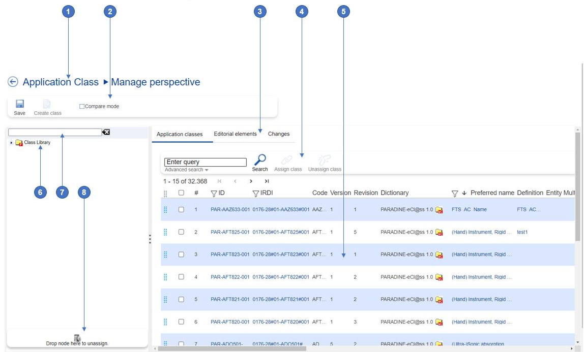
|
No. |
Name |
Description |
|---|---|---|
|
1 |
Breadcrumb |
Breadcrumb is a mandatory block that is present on every page and displays which page the user is currently on. It also allows you to quickly go to previous pages from the same chain of links. |
|
2 |
Perspective toolbar |
Allows users to work on the data displayed in the tree view (to create new Classification Classes or to compare different structures) |
|
3 |
Tabs |
Allows users to switch between the Structure Elements to be added to the organizing objects (classification classes), respectively to see Changes that will be performed, before saving them. |
|
4 |
List toolbar |
Allows users to work on the Structure Elements displayed in the list (assign Structure Elements to Classification Classes/unassign Structure Elements from Classification Classes) |
|
5 |
Configurable table view |
Allows user to view available content in an organized way, which may be configured to their own needs. |
|
6 |
Perspective tree |
Displays the Structure Elements in a perspective view. |
|
7 |
Search field |
Allows users to enter their search string in order to easily retrieve needed data. |
|
8 |
Unassign area |
Allows users to unassign Structure Elements from Classification Classes by using drag and drop. |
Perspective Toolbar
|
Button Icon |
Button Name |
Description |
|---|---|---|
|
|
Save |
Allows users to save changes performed in the perspective view. |
|
|
Create Class |
Allows users to create new Classification Classes in the perspective view. |
|
|
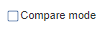
Compare Mode |
Allows users to compare business objects or structures. |


List Toolbar
|
Button Icon |
Button Name |
Description |
|---|---|---|
|
|
Search |
Triggers a search in the available content, considering the search options set in the advanced search. |
|
|
Assign |
Allows users to assign the Structure Elements selected in the table view to a Classification Class selected in the perspective view. |
|
|
Unassign |
Allows users to unassign the Structure Elements selected in the perspective view from its Classification Class. |


Compare View
Two or more Structure Elements of the same type can be opened side by side in a compare view. The attributes (standard and extended) displayed in the Compare graphical user interface are configurable.
Different values of the attributes are highlighted by the system in blue color.
The compare view offers users two options:
-
Equal values: this options will include in the compare view also the attributes having equal value.
-
Empty values: this option will include in the compare view also the attributes having no value.
The Structure Element displayed on the first position in the compare view may be changed by using the pin-button on the header of the column. Structure Elements may be removed from the compare view by using the trash-bin button.
The compared Structure Elements can be exported in Excel format.